項(xiàng)目背景
· Shenzhen Next Star Technology Co.,Ltd, founded in 2009, is a high-tech enterprise specialized in R&D,manufacturing and selling IPTV, SoundBar, smart Projector and peripheral intelligent products. Next-Star’s R&D base is located in the whole 8th floor, Baojie’an Trading Center,Shenzhen; Shifeng International Building, Chaoyang North Rd., Daxing Distric, Beijing; and Ace High -End Tower 3, Gasan-Dong 371-50, Geumcheon-Gu,Seoul, Korea.Next-Star has three processing plants which are located at Shiyan,Shenzhen, Huizhou and Dongguan; and respectively manufacture smart set-top boxes, projection, smart SoundBar and peripheral intelligent products.
· Unswervingly based on scientific and technological innovation, product technology research and development with great concentration,and pay attention to product quality and good faith service, Next-Star brought together a group of professional and technical fields of talents, has four independent R&D brands (NEXTSTAR, ipremium,Topfree, AZfox) at present and is cooperating with world famous brands (ZTE,Mundi, NTC, BENJAMIN,AVOV, Probox...).
· "Based on innovation, focus on quality, good faith service, sincere cooperation and common development" is Next-Star’s constant pursuit; for customers to provide high-quality, safe, reliable products are always the policy of company; we will constantly surpass ourselves and create value for customers as always to provide more high-quality technology, products and service.
設(shè)計(jì)說(shuō)明
根據(jù)對(duì)耐斯拓的了解,我做了以下規(guī)劃:
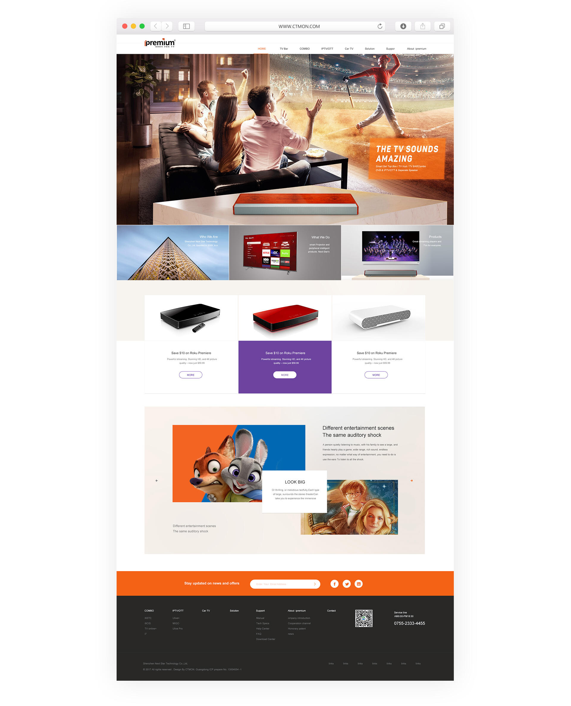
首頁(yè)展示就像一個(gè)電影的預(yù)告片一樣,不能把所有的故事情節(jié)都說(shuō)清楚��,但是可以把主題說(shuō)清楚!所以我根據(jù)欄目圖和資料做了下整理,耐斯拓主要以智能機(jī)頂盒產(chǎn)品為主���,主要應(yīng)用在電視上面,裝了這個(gè)機(jī)頂盒之后可以有更多的電視節(jié)目和音質(zhì)效果等����。
所以板塊大致為:1.表達(dá)產(chǎn)品應(yīng)用,2.我們還做哪些產(chǎn)品�? 3.產(chǎn)品的優(yōu)勢(shì) 4.聯(lián)系我們
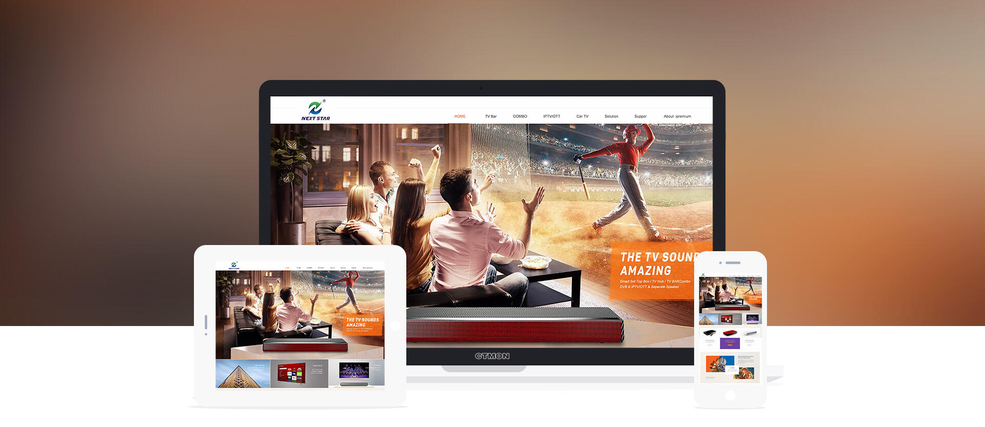
第一張圖主要想告訴用戶(hù)我們是做什么產(chǎn)品,用在哪里���,所以是以產(chǎn)品的使用場(chǎng)景為主��;
場(chǎng)景為歡快的氣氛�,圖為一群年輕人在看電視����,十分投入跟享受!之所以沒(méi)有把電視機(jī)畫(huà)出來(lái)��,是想突破一下常規(guī)�����,傳達(dá)出感覺(jué)像在影院觀影一樣的感受,用人物場(chǎng)景表達(dá)更加有代入感��,用戶(hù)在看這張圖的時(shí)候好像自己在其中體驗(yàn)一樣�����,那如此吸引人的電視和節(jié)目又好像在影院一樣感受���,是有什么特殊原因呢����?這時(shí)候就會(huì)看到我們的產(chǎn)品�����,因?yàn)橛杏玫轿覀兊闹悄軝C(jī)頂盒產(chǎn)品�����,從而凸顯出我們的產(chǎn)品�����!以及應(yīng)用的優(yōu)勢(shì)���。
第二屏是帶著用戶(hù)的思考去看下面三塊內(nèi)容:1.我們是誰(shuí)�����? 2.我們做什么����? 3.我們的主營(yíng)產(chǎn)品是什么��?
用戶(hù)第一眼被海報(bào)吸引后肯定會(huì)繼續(xù)往下了解�,會(huì)想我們是誰(shuí),我們主要做什么���,我們還做什么等等問(wèn)題���;
第三屏主要是推薦產(chǎn)品可以看到不同的分類(lèi)產(chǎn)品,這就解答了用戶(hù)心里(我們還做什么�����?)
第四屏主要是表現(xiàn)產(chǎn)品的優(yōu)勢(shì):電視盒子可以看大片�,可以在線玩游戲���,可以...; 所以第四屏是可以左右切換,每切換一個(gè)換一個(gè)優(yōu)勢(shì)��!
第五屏就是底部導(dǎo)航了����,如果用戶(hù)對(duì)我們產(chǎn)品有需要就可以填寫(xiě)郵箱提交給我們,或者電話聯(lián)系我們����,但是國(guó)外一般會(huì)使用郵件比較多所以郵箱位置更加凸顯!
整體顏色搭配:白色打底����,橙色輔助,紫色點(diǎn)綴�����; 鮮亮有活力更容易和年輕人拉近距離�����,這也是從我們產(chǎn)品的使用群體去考慮的�;
排版:排版以整潔為主,在小點(diǎn)綴方面用了斜角對(duì)稱(chēng)����,這也是從我們logo獲得的靈感,logo是左右對(duì)稱(chēng)的���,有一點(diǎn)像右上角傾斜有中運(yùn)動(dòng)感�!所以海報(bào)圖上面的文字用了一點(diǎn)向上傾斜作為點(diǎn)綴���,優(yōu)勢(shì)板塊用了左右對(duì)稱(chēng)作為點(diǎn)綴��!這樣可以起到收尾呼應(yīng)�����!
整體調(diào)性:圖片處理為歐美大片的風(fēng)格����,這跟我們的產(chǎn)品應(yīng)用更加接近�,同時(shí)品牌感提升!色調(diào)一致會(huì)更加舒適耐看��。
顏色
-
f46215
-
f7f4ef
-
666666
-
333333









 粵公網(wǎng)安備 44030602002431號(hào)